
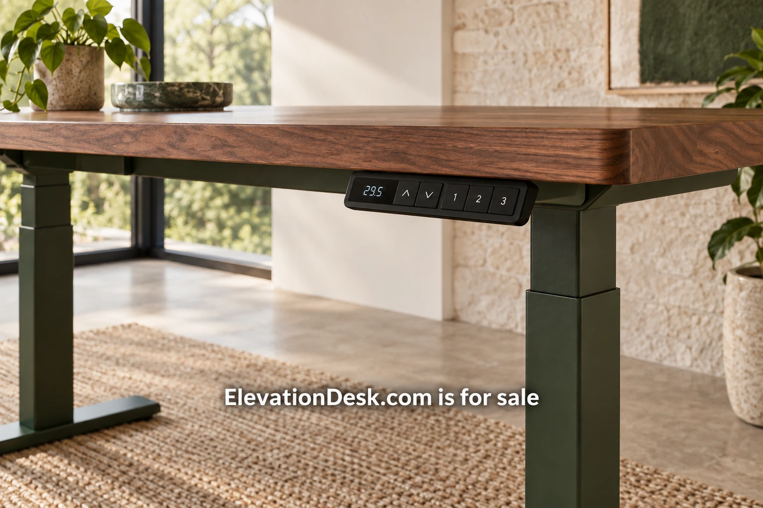
A standing desk product page has to answer several kinds of question at once. The buyer needs to imagine the furniture in a room, compare a configuration, understand delivery and judge whether support is credible. Attractive room photography helps with the first task. It cannot carry the rest alone. This guide offers a practical information plan for a furniture business developing or improving a product page.
Make the configuration clear at the beginning
Show the product title, the selected surface size, the finish and the frame choice together. If changing a selector changes the image, dimensions or included components, update the relevant information where the buyer can see it. A page should not leave a customer wondering whether the photograph shows the configuration currently selected.
Identify what comes with the desk. A scene may include a chair, monitor arm, cable tray and computer equipment, but those objects are not necessarily part of the purchase. Place an included-items summary close to the main offer and label optional accessories consistently. The buyer should not need to inspect the small print to discover that a prominent part of the setup is separate.
Use material terms precisely. A walnut finish, a walnut veneer and a solid walnut surface describe different products. Explain the actual construction and the finish used. If natural variation is relevant, show representative detail images and state the limits of a sample. Styling language should support the specification rather than replace it.
Give dimensions their own useful presentation
Provide a diagram showing the desktop width and depth, base dimensions and assembled height range. Identify which dimensions change between configurations. Add measurements for relevant clearances and accessory locations where the manufacturer can supply them. Include units consistently and avoid mixing frame-only measurements with complete-desk measurements.
The diagram should remain readable on a phone. If the labels become tiny in a wide image, provide a clear text table beside it. A buyer often compares the page with measurements taken in a room, so plain numbers and descriptive labels are more useful than decorative graphics.
OSHA’s workstation desk guidance treats the surface and the space beneath it as parts of workstation planning. A brand can point readers to that general reference while explaining its actual dimensions. Keep the distinction clear: an informational link does not certify that the product fits an individual user or meets every requirement in a workplace.
Explain height travel and equipment limits
State the assembled minimum and maximum height and how they were measured. If fittings alter the range, describe that relationship. Explain the controls shown in the product photographs, including any available presets, without implying that a particular position is right for every user.
Define the rated capacity according to the manufacturer’s documentation. Say what is included in that figure and whether different configurations have different limits. If test conditions or use restrictions apply, make them available in accessible language. A large number without a definition invites buyers to make assumptions the business may not intend.
Accessory compatibility deserves a specific section. Identify permitted monitor-arm clamping areas, surface restrictions and approved mounting methods where those facts are established. Do not claim compatibility with every arm or accessory simply because several familiar examples fit. Link to actual instructions and keep version information available when the product changes.
Photograph what the buyer needs to inspect
Use a complete room image for scale, a clear product view for the configuration and detail images for materials, controls and cable fittings. Show the product at more than one height. Photograph the underside when it explains assembly or cable management. Those images answer different questions and should have descriptive alternative text.
A buyer should be able to distinguish a real product photograph from a visualization. Label illustrative room scenes appropriately. If an accessory or arrangement is shown only to demonstrate an idea, avoid using the image as evidence of a tested configuration. Honest labeling keeps the product information useful as the page develops.
Short demonstrations can show how a control behaves or how a tray is accessed. Keep demonstrations focused and provide text for the relevant facts. A video should not be the only place to find a measurement or an assembly requirement because some readers cannot or prefer not to watch it.
Make assembly predictable
Describe the assembly required, the tools supplied and any tools the customer must provide. Give the number and size of cartons when known. Explain if the instructions call for two people for a particular step. Avoid presenting assembly as effortless unless the business has evidence that supports the wording across the actual product configurations.
Offer the assembly instructions before purchase. A customer can then decide whether they have the space, help and equipment required. A clear guide can also reveal whether the product is appropriate for a customer who expects a fully assembled delivery. If paid assembly is available, state its coverage and exclusions separately.
Test the instructions with someone unfamiliar with the product. Record where they pause, which parts are hard to identify and which diagram is unclear. The resulting improvements belong in the guide and, where relevant, the product page. Watching that trial gives the team a better basis for an estimated assembly description than the time taken by an experienced installer.
Explain delivery in ordinary terms
Tell buyers where the product ships, how delivery is arranged and what the carrier provides. A delivery to a building entrance differs from a service that places cartons in the chosen room. Stairs, elevators, restricted access and appointment windows should be addressed according to the actual offer.
If the lead time depends on configuration or stock, show the applicable estimate after selection and explain what could change it. Do not use a generic shipping message where a particular finish has a different schedule. Give customers a contact route for access questions before they order.
A damage procedure should say what the customer needs to record and how to contact support. The page does not need to reproduce every operational detail, but a buyer should know that the process exists and where its full terms can be read. Avoid promises about immediate replacement unless the business can meet them.
Put warranty and returns within reach
Summarize the warranty scope and link to the complete terms. Identify any distinction between the frame, electronic components and surface if the actual policy makes one. Explain who provides the warranty and how a claim begins. The term length alone does not describe what is covered.
Returns need similarly clear information. State the applicable window, condition requirements, handling responsibilities and costs under the actual policy. Large furniture can be difficult to repack, so explain packaging requirements before purchase. The business should have its policies reviewed for the markets in which it trades rather than copying another retailer’s wording.
Build a comparison that answers a decision
An illustrative two-size range can compare width, depth, base footprint and tested example equipment arrangements. Keep finishes separate if they do not change those facts. If two frames differ, explain the actual functional difference. Do not create a long comparison table filled with identical rows solely to make the range seem more extensive.
OSHA’s monitor guidance can support a general discussion of equipment placement. Product-specific claims still require product evidence. Health or performance promises need their own appropriate substantiation and should not be inferred from the fact that a desk adjusts. A careful page can be persuasive through useful information without borrowing a promise it cannot prove.
Audit one page before redesigning everything
Choose one configuration and follow the path from first image to delivery terms. List every question that remains unanswered: dimensions, included items, limits, assembly, support or returns. Ask someone outside the team to do the same exercise and compare the questions.
Improve the missing information first. A buyer who can understand the product, plan its arrival and find support has a stronger basis for a decision. The next step is a concise question checklist applied to one real page, with each answer tied to current specifications or the business’s actual policies.